b
props.children and proptypes
Displaying the login form only when appropriate
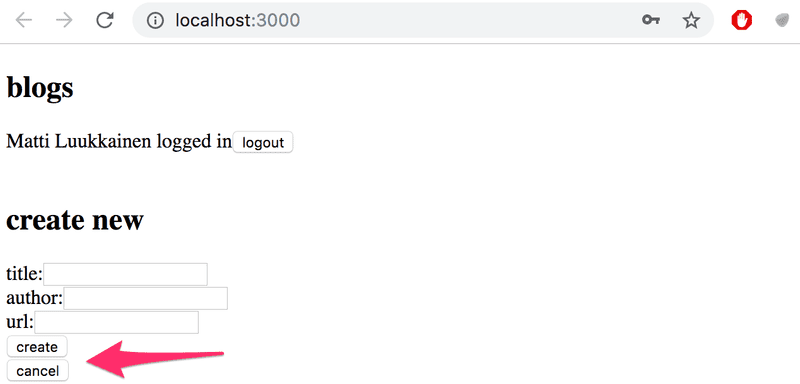
Let's modify the application so that the login form is not displayed by default:
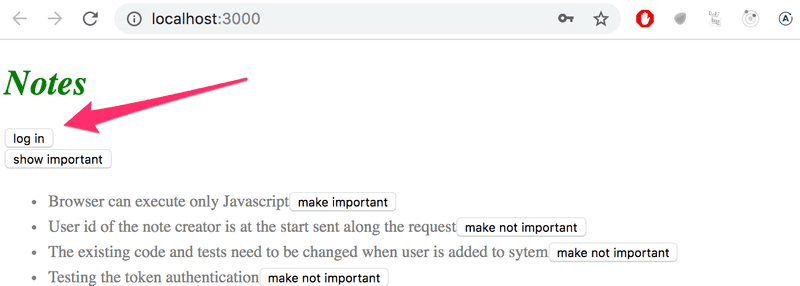
The login form appears when the user presses the login button:
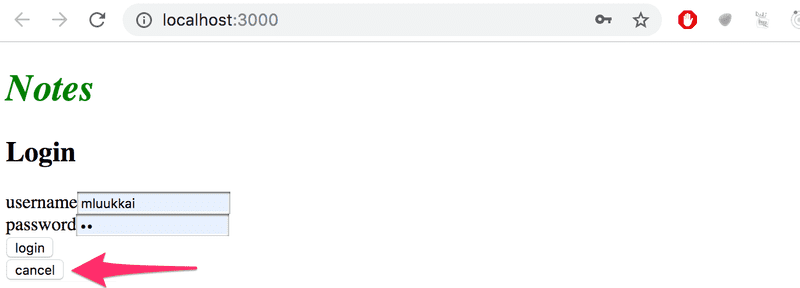
The user can close the login form by clicking the cancel button.
Let's start by extracting the login form into its own component:
import React from 'react'

const LoginForm = ({
   handleSubmit,
   handleUsernameChange,
   handlePasswordChange,
   username,
   password
  }) => {
  return (
    <div>
      <h2>Login</h2>

      <form onSubmit={handleSubmit}>
        <div>
          username
          <input
            value={username}
            onChange={handleUsernameChange}
          />
        </div>
        <div>
          password
          <input
            type="password"
            value={password}
            onChange={handlePasswordChange}
          />
      </div>
        <button type="submit">login</button>
      </form>
    </div>
  )
}

export default LoginForm
The state and all the functions related to it are defined outside of the component and are passed to the component as props.
Notice that the props are assigned to variables through destructuring, which means that instead of writing:
const LoginForm = (props) => {
  return (
    <div>
      <h2>Login</h2>
      <form onSubmit={props.handleSubmit}>
        <div>
          username
          <input
            value={props.username}
            onChange={props.handleChange}
            name="username"
          />
        </div>
        // ...
        <button type="submit">login</button>
      </form>
    </div>
  )
}
where the properties of the props object are accessed through e.g. props.handleSubmit, the properties are assigned directly to their own variables.
One fast way of implementing the functionality is to change the loginForm function of the App component like so:
const App = () => {
  const [loginVisible, setLoginVisible] = useState(false)
  // ...

  const loginForm = () => {
    const hideWhenVisible = { display: loginVisible ? 'none' : '' }
    const showWhenVisible = { display: loginVisible ? '' : 'none' }

    return (
      <div>
        <div style={hideWhenVisible}>
          <button onClick={() => setLoginVisible(true)}>log in</button>
        </div>
        <div style={showWhenVisible}>
          <LoginForm
            username={username}
            password={password}
            handleUsernameChange={({ target }) => setUsername(target.value)}
            handlePasswordChange={({ target }) => setPassword(target.value)}
            handleSubmit={handleLogin}
          />
          <button onClick={() => setLoginVisible(false)}>cancel</button>
        </div>
      </div>
    )
  }

  // ...
}
The App components state now contains the boolean loginVisible, that defines if the login form should be shown to the user or not.
The value of loginVisible is toggled with two buttons. Both buttons have their event handlers defined directly in the component:
<button onClick={() => setLoginVisible(true)}>log in</button>

<button onClick={() => setLoginVisible(false)}>cancel</button>
The visibility of the component is defined by giving the component an inline style rule, where the value of the display property is none if we do not want the component to be displayed:
const hideWhenVisible = { display: loginVisible ? 'none' : '' }
const showWhenVisible = { display: loginVisible ? '' : 'none' }

<div style={hideWhenVisible}>
  // button
</div>

<div style={showWhenVisible}>
  // button
</div>
We are once again using the "question mark" ternary operator. If loginVisible is true, then the CSS rule of the component will be:
display: 'none';If loginVisible is false, then display will not receive any value related to the visibility of the component.
The components children, aka. props.children
The code related to managing the visibility of the login form could be considered to be its own logical entity, and for this reason it would be good to extract it from the App component into its own separate component.
Our goal is to implement a new Togglable component that can be used in the following way:
<Togglable buttonLabel='login'>
  <LoginForm
    username={username}
    password={password}
    handleUsernameChange={({ target }) => setUsername(target.value)}
    handlePasswordChange={({ target }) => setPassword(target.value)}
    handleSubmit={handleLogin}
  />
</Togglable>
The way that the component is used is slightly different from our previous components. The component has both an opening and a closing tags which surround a LoginForm component. In React terminology LoginForm is a child component of Togglable.
We can add any React elements we want between the opening and closing tags of Togglable, like this for example:
<Togglable buttonLabel="reveal">
  <p>this line is at start hidden</p>
  <p>also this is hidden</p>
</Togglable>
The code for the Togglable component is shown below:
import React, { useState } from 'react'

const Togglable = (props) => {
  const [visible, setVisible] = useState(false)

  const hideWhenVisible = { display: visible ? 'none' : '' }
  const showWhenVisible = { display: visible ? '' : 'none' }

  const toggleVisibility = () => {
    setVisible(!visible)
  }

  return (
    <div>
      <div style={hideWhenVisible}>
        <button onClick={toggleVisibility}>{props.buttonLabel}</button>
      </div>
      <div style={showWhenVisible}>
        {props.children}
        <button onClick={toggleVisibility}>cancel</button>
      </div>
    </div>
  )
}

export default Togglable
The new and interesting part of the code is props.children, that is used for referencing the child components of the component. The child components are the React elements that we define between the opening and closing tags of a component.
This time the children are rendered in the code that is used for rendering the component itself:
<div style={showWhenVisible}>
  {props.children}
  <button onClick={toggleVisibility}>cancel</button>
</div>
Unlike the "normal" props we've seen before, children is automatically added by React and always exists. If a component is defined with an automatically closing /> tag, like this:
<Note
  key={note.id}
  note={note}
  toggleImportance={() => toggleImportanceOf(note.id)}
/>
Then props.children is an empty array.
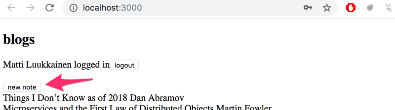
The Togglable component is reusable and we can use it to add similar visibility toggling functionality to the form that is used for creating new notes.
Before we do that, let's extract the form for creating notes into its own component:
const NoteForm = ({ onSubmit, handleChange, value}) => {
  return (
    <div>
      <h2>Create a new note</h2>

      <form onSubmit={onSubmit}>
        <input
          value={value}
          onChange={handleChange}
        />
        <button type="submit">save</button>
      </form>
    </div>
  )
}
Next let's define the form component inside of a Togglable component:
<Togglable buttonLabel="new note">
  <NoteForm
    onSubmit={addNote}
    value={newNote}
    handleChange={handleNoteChange}
  />
</Togglable>
You can find the code for our current application in its entirety in the part5-4 branch of this github repository.
References to components with ref
Our current implementation is quite good, it has one aspect that could be improved.
After a new note is created, it would make sense to hide the new note form. Currently the form stays visible. There is a slight problem with hiding the form. The visibility is controlled with the visible variable inside of the Togglable component. How can we access it outside of the component?
There are many ways to implement closing the form from the parent component, but let's use the ref mechanism of React, which offers a reference to the component.
Let's make the following changes to the App component:
const App = () => {
  // ...
  const noteFormRef = React.createRef()
  const noteForm = () => (
    <Togglable buttonLabel="new note" ref={noteFormRef}>      <NoteForm
        onSubmit={addNote}
        value={newNote}
        handleChange={handleNoteChange}
      />
    </Togglable>
  )

  // ...
}
The createRef method is used to create a noteFormRef ref, that is assigned to the Togglable component containing the creation note form. The noteFormRef variable acts as a reference to the component.
We also make the following changes to the Togglable component:
import React, { useState, useImperativeHandle } from 'react'
const Togglable = React.forwardRef((props, ref) => {  const [visible, setVisible] = useState(false)

  const hideWhenVisible = { display: visible ? 'none' : '' }
  const showWhenVisible = { display: visible ? '' : 'none' }

  const toggleVisibility = () => {
    setVisible(!visible)
  }

  useImperativeHandle(ref, () => {    return {      toggleVisibility    }  })
  return (
    <div>
      <div style={hideWhenVisible}>
        <button onClick={toggleVisibility}>{props.buttonLabel}</button>
      </div>
      <div style={showWhenVisible}>
        {props.children}
        <button onClick={toggleVisibility}>cancel</button>
      </div>
    </div>
  )
})
export default Togglable
The function that creates the component is wrapped inside of a forwardRef function call. This way the component can access the ref that is assigned to it.
The component uses the useImperativeHandle hook to make its toggleVisibility function available outside of the component.
We can now hide the form by calling noteFormRef.current.toggleVisibility() after a new note has been created:
const App = () => {
  // ...
  const addNote = (event) => {
    event.preventDefault()
    noteFormRef.current.toggleVisibility()    const noteObject = {
      content: newNote,
      date: new Date().toISOString(),
      important: Math.random() > 0.5
    }

    noteService
      .create(noteObject).then(returnedNote => {
        setNotes(notes.concat(returnedNote))
        setNewNote('')
      })
  }
  // ...
}
To recap, the useImperativeHandle function is a React hook, that is used for defining functions in a component which can be invoked from outside of the component.
This trick works for changing the state of a component, but it looks a bit unpleasant. We could have accomplished the same functionality with slightly cleaner code using "old React" class-based components. We will take a look at these class components at the end of this part of the course material. So far this is the only situation where using React hooks leads to code that is not cleaner than with class components.
There are also other use cases for refs than accessing React components.
You can find the code for our current application in its entirety in the part5-5 branch of this github repository.
One point about components
When we define a component in React:
const Togglable = () => ...
  // ...
}
And use it like this:
<div>
  <Togglable buttonLabel="1" ref={togglable1}>
    first
  </Togglable>

  <Togglable buttonLabel="2" ref={togglable2}>
    second
  </Togglable>

  <Togglable buttonLabel="3" ref={togglable3}>
    third
  </Togglable>
</div>
We create three separate instances of the component that all have their own separate state:
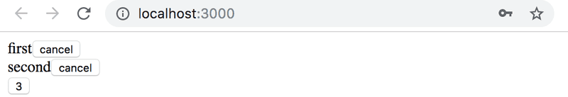
The ref attribute is used for assigning a reference to each of the components in the variables togglable1, togglable2 and togglable3.
Exercises
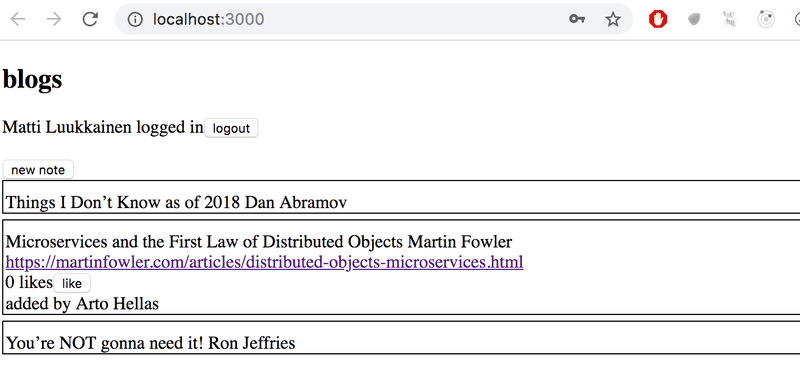
5.5 Blog list frontend, step5
Change the form for creating blog posts so that it is only displayed when appropriate. Use functionality similar to what was shown earlier in this part of the course material. If you wish to do so, you can use the Togglable component defined in part 5.
By default the form is not visible
It expands when button new note is clicked
5.6* Blog list frontend, step6
Modify the blog list so that all of the information about a blog post is displayed when its name is clicked:
Clicking the name of an expanded blog post should hide the additional information.
At this point the like button does not need to do anything.
The application shown in the picture has a bit of additional CSS to improve its appearance.
It is easy to add styles to the application as shown in part 2 using inline styles:
const Blog = ({ blog }) => {
  const blogStyle = {
    paddingTop: 10,
    paddingLeft: 2,
    border: 'solid',
    borderWidth: 1,
    marginBottom: 5
  }

  return (
    <div style={blogStyle}>
      <div onClick={() => console.log('clicked')}>        {blog.title} {blog.author}
      </div>
      // ...
  </div>
)}
NB1: you can make the name of a blog post click-able as shown in the part of the code that is highlighted.
NB2: even though the functionality implemented in this part is almost identical to the functionality provided by the Togglable component, the component can not be used directly to achieve the desired behavior. The easiest solution will be to add state to the blog post that controls the displayed form of the blog post.
5.7*: Blog list frontend, step7
Implement the functionality for the like button. Likes are increased by making an HTTP PUT request to the unique address of the blog post in the backend.
Since the backend operation replaces the entire blog post, you will have to send all of its fields in the request body. If you wanted to add a like to the following blog post:
{
  _id: "5a43fde2cbd20b12a2c34e91",
  user: {
    _id: "5a43e6b6c37f3d065eaaa581",
    username: "mluukkai",
    name: "Matti Luukkainen"
  },
  likes: 0,
  author: "Joel Spolsky",
  title: "The Joel Test: 12 Steps to Better Code",
  url: "https://www.joelonsoftware.com/2000/08/09/the-joel-test-12-steps-to-better-code/"
},
You would have to make an HTTP PUT request to the address /api/blogs/5a43fde2cbd20b12a2c34e91 with the following request data:
{
  user: "5a43e6b6c37f3d065eaaa581",
  likes: 1,
  author: "Joel Spolsky",
  title: "The Joel Test: 12 Steps to Better Code",
  url: "https://www.joelonsoftware.com/2000/08/09/the-joel-test-12-steps-to-better-code/"
}
One last warning: if you notice that you are using async/await and the then-method in the same code, it is almost certain that you are doing something wrong. Stick to using one or the other, and never use both at the same time "just in case".
5.8*: Blog list frontend, step8
Modify the application to list the blog posts by the number of likes. Sorting the blog posts can be done with the array sort method.
5.9*: Blog list frontend, step9
Add a new button for deleting blog posts. Also implement the logic for deleting blog posts in the backend.
Your application could look something like this:
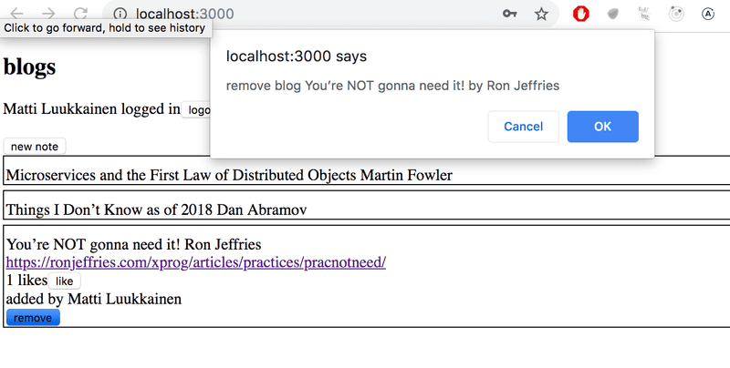
The confirmation dialog for deleting a blog post is easy to implement with the window.confirm function.
5.10*: Blog list frontend, step10
Show the button for deleting a blog post only if the blog post was added by the user.
PropTypes
The Togglable component assumes that it is given the text for the button via the buttonLabel prop. If we forget to define it to the component:
<Togglable> buttonLabel forgotten... </Togglable>The application works, but the browser renders a button that that has no label text.
We would like to enforce that when the Togglable component is used, the button label text prop must be given a value.
The expected and required props of a component can be defined with the prop-types package. Let's install the package:
npm install --save prop-typesWe can define the buttonLabel prop as a mandatory or required string-type prop as shown below:
import PropTypes from 'prop-types'

const Togglable = React.forwardRef((props, ref) => {
  // ..
}

Togglable.propTypes = {
  buttonLabel: PropTypes.string.isRequired
}
The console will display the following error message if the prop is left undefined:
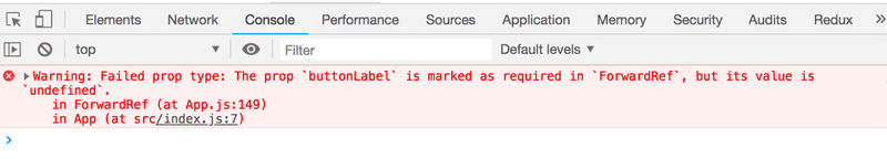
The application still works and nothing forces us to define props despite the PropTypes definitions. Mind you, it is extremely unprofessional to leave any red output to the browser console.
Let's also define PropTypes to the LoginForm component:
import PropTypes from 'prop-types'

const LoginForm = ({
   handleSubmit,
   handleUsernameChange,
   handlePasswordChange,
   username,
   password
  }) => {
    // ...
  }

LoginForm.propTypes = {
  handleSubmit: PropTypes.func.isRequired,
  handleUsernameChange: PropTypes.func.isRequired,
  handlePasswordChange: PropTypes.func.isRequired,
  username: PropTypes.string.isRequired,
  password: PropTypes.string.isRequired
}
Prop types for functional components are defined the same way as for class components.
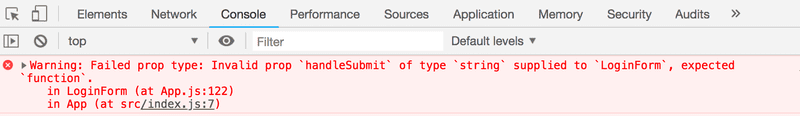
If the type of a passed prop is wrong, e.g. if we try to define the handleSubmit prop as a string, then this will result in the following warning:
ESlint
In part 3 we configured the ESlint code style tool to the backend. Let's take ESlint to use in the frontend as well.
Create-react-app has installed ESlint to the project by default, so all that's left for us to do is to define our desired configuration in the .eslintrc.js file.
NB: do not run the npm init command. It will install the latest version of ESlint that is not compatible with the configuration file created by create-react-app!
Next, we will start testing the frontend and in order to avoid undesired and irrelevant linter errors we will install the eslint-jest-plugin package:
npm add --save-dev eslint-plugin-jestLet's create a .eslintrc.js file with the following contents:
module.exports = {
  "env": {
      "browser": true,
      "es6": true,
      "jest/globals": true  },
  "extends": [       "eslint:recommended",      "plugin:react/recommended"  ],  "parserOptions": {
      "ecmaFeatures": {
          "jsx": true
      },
      "ecmaVersion": 2018,
      "sourceType": "module"
  },
  "plugins": [
      "react", "jest"  ],
  "rules": {
      "indent": [
          "error",
          2      ],
      "linebreak-style": [
          "error",
          "unix"
      ],
      "quotes": [
          "error",
          "single"
      ],
      "semi": [
          "error",
          "never"
      ],
      "eqeqeq": "error",      "no-trailing-spaces": "error",      "object-curly-spacing": [          "error", "always"      ],      "arrow-spacing": [          "error", { "before": true, "after": true }      ],      "no-console": 0,      "react/prop-types": 0  }
};
Let's create .eslintignore file with the following contents to the repository root
node_modules
build
Now the directories build and node_modules will be skipped when linting.
Let us also create a npm script to run the lint:
{
  // ...
  {
    "scripts": {
    "start": "react-scripts start",
    "build": "react-scripts build",
    "test": "react-scripts test",
    "eject": "react-scripts eject",
    "server": "json-server -p3001 db.json",
    "eslint": "eslint ."  },
  // ...
}
You can find the code for our current application in its entirety in the part5-6 branch of this github repository.

