e
Adding styles to React app
The appearance of our current application is quite modest. In exercise 0.2, the assignment was to go through Mozilla's CSS tutorial.
Before we move onto the next part, let's take a look at how we can add styles to a React application. There are several different ways of doing this and we will take a look at the other methods later on. At first, we will add CSS to our application the old-school way; in a single file without using a CSS preprocessor (although this is not entirely true as we will learn later on).
Let's add a new index.css file under the src directory and then add it to the application by importing it in the index.js file:
import './index.css'Let's add the following CSS rule to the index.css file:
h1 {
  color: green;
}
CSS rules comprise of selectors and declarations. The selector defines which elements the rule should be applied to. The selector above is h1, which will match all of the h1 header tags in our application.
The declaration sets the color property to the value green.
One CSS rule can contain an arbitrary number of properties. Let's modify the previous rule to make the text cursive, by defining the font style as italic:
h1 {
  color: green;
  font-style: italic;}
There are many ways of matching elements by using different types of CSS selectors.
If we wanted to target, let's say, each one of the notes with our styles, we could use the selector li, as all of the notes are wrapped inside li tags:
const Note = ({ note, toggleImportance }) => {
  const label = note.important
    ? 'make not important'
    : 'make important';

  return (
    <li>
      {note.content}
      <button onClick={toggleImportance}>{label}</button>
    </li>
  )
}
Let's add the following rule to our style sheet (since my knowledge of elegant web design is close to zero, the styles don't make much sense):
li {
  color: grey;
  padding-top: 3px;
  font-size: 15px;
}
Using element types for defining CSS rules is slightly problematic. If our application contained other li tags, the same style rule would also be applied to them.
If we want to apply our style specifically to notes, then it is better to use class selectors.
In regular HTML, classes are defined as the value of the class attribute:
<li class="note">some text...</li>In React we have to use the className attribute instead of the class attribute. With this in mind, let's make the following changes to our Note component:
const Note = ({ note, toggleImportance }) => {
  const label = note.important
    ? 'make not important'
    : 'make important';

  return (
    <li className='note'>      {note.content}
      <button onClick={toggleImportance}>{label}</button>
    </li>
  )
}
Class selectors are defined with the .classname syntax:
.note {
  color: grey;
  padding-top: 5px;
  font-size: 15px;
}
If you now add other li elements to the application, they will not be affected by the style rule above.
Improved error message
We previously implemented the error message that was displayed when the user tried to toggle the importance of a deleted note with the alert method. Let's implement the error message as its own React component.
The component is quite simple:
const Notification = ({ message }) => {
  if (message === null) {
    return null
  }

  return (
    <div className="error">
      {message}
    </div>
  )
}
If the value of the message prop is null, then nothing is rendered to the screen, and in other cases the message gets rendered inside of a div element.
Let's add a new piece of state called errorMessage to the App component. Let's initialize it with some error message so that we can immediately test our component:
const App = () => {
  const [notes, setNotes] = useState([])
  const [newNote, setNewNote] = useState('')
  const [showAll, setShowAll] = useState(true)
  const [errorMessage, setErrorMessage] = useState('some error happened...')
  // ...

  return (
    <div>
      <h1>Notes</h1>

      <Notification message={errorMessage} />
      <div>
        <button onClick={() => setShowAll(!showAll)}>
          show {showAll ? 'important' : 'all'}
        </button>
      </div>
      <ul>
        {rows()}
      </ul>

      <form onSubmit={addNote}>
        <input
          value={newNote}
          onChange={handleNoteChange}
        />
        <button type="submit">show</button>
      </form>
    </div>
  )
}
Then let's add a style rule that suits an error message:
.error {
  color: red;
  background: lightgrey;
  font-size: 20px;
  border-style: solid;
  border-radius: 5px;
  padding: 10px;
  margin-bottom: 10px;
}
Now we are ready to add the logic for displaying the error message. Let's change the toggleImportanceOf function in the following way:
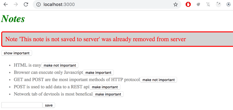
  const toggleImportanceOf = id => {
    const note = notes.find(n => n.id === id)
    const changedNote = { ...note, important: !note.important }

    noteService
      .update(changedNote).then(returnedNote => {
        setNotes(notes.map(note => note.id !== id ? note : returnedNote))
      })
      .catch(error => {
        setErrorMessage(          `Note '${note.content}' was already removed from server`        )        setTimeout(() => {          setErrorMessage(null)        }, 5000)        setNotes(notes.filter(n => n.id !== id))
      })
  }
When the error occurs we add a descriptive error message to the errorMessage state. At the same time we start a timer, that will set the errorMessage state to null after five seconds.
The result looks like this:
The code for the current state of our application can be found in the part2-7 branch on github.
Inline styles
React also makes it possible to write styles directly in the code as so-called inline styles.
The idea behind defining inline styles is extremely simple. Any React component or element can be provided with a set of CSS properties as a JavaScript object through the style attribute.
CSS rules are defined slightly differently in JavaScript than in normal CSS files. Let's say that we wanted to give some element the color green and italic font that's 16 pixels in size. In CSS, it would look like this:
{
  color: green;
  font-style: italic;
  font-size: 16px;
}
But as a React inline style object it would look like this:
 {
  color: 'green',
  fontStyle: 'italic',
  fontSize: 16
}
Every CSS property is defined as a separate property of the JavaScript object. Numeric values for pixels can be simply defined as integers. One of the major differences compared to regular CSS, is that hyphenated (kebab case) CSS properties are written in camelCase.
Next, we could add a "bottom block" to our application by creating a Footer component and define the following inline styles for it:
const Footer = () => {
  const footerStyle = {
    color: 'green',
    fontStyle: 'italic',
    fontSize: 16
  }

  return (
    <div style={footerStyle}>
      <br />
      <em>Note app, Department of Computer Science, University of Helsinki 2019</em>
    </div>
  )
}

const App = () => {
  // ...

  return (
    <div>
      <h1>Notes</h1>

      <Notification message={errorMessage} />

      // ...

      <Footer />    </div>
  )
}
Inline styles come with certain limitations. For instance, so-called pseudo-classes can't be used straightforwardly.
Inline styles and some of the other ways of adding styles to React components go completely against the grain of old conventions. Traditionally, it has been considered the best practice to entirely separate CSS from the content (HTML) and functionality (JavaScript). According to this older school of thought, the goal was to write CSS, HTML, and JavaScript into their separate files.
The philosophy of React is, in fact, the polar opposite of this. Since the separation of CSS, HTML, and JavaScript into separate files did not seem to scale well in larger applications, React bases the division of the application along the lines of its logical functional entities.
The structural units that make up the application's functional entities are React components. A React component defines the HTML for structuring the content, the JavaScript functions for determining functionality, and also the component's styling; all in one place. This is to create individual components that are as independent and reusable as possible.
Exercises
2.19: Phonebook step11
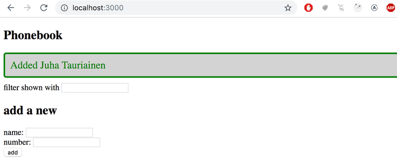
Use the improved error message example from part 2 as a guide to show a notification that lasts for a few seconds after a successful operation is executed (a person is added or a number is changed):
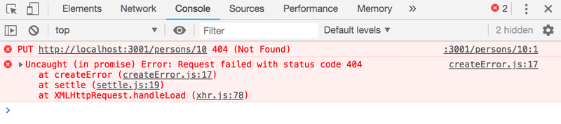
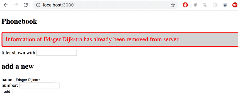
2.20*: Phonebook step12
Open your application in two browsers. If you delete a person in browser 1 a short while before attempting to change the person's phone number in browser 2, you will get the following error message:
Fix the issue according to the example shown in promise and errors in part 2. Modify the example so that the user is shown a message when the operation does not succeed. The messages shown for successful and unsuccessful events should look different:
This was the last exercise of this part of the course. It's time to push your code to GitHub and mark all of your finished exercises to the exercise submission system.

