b
More about styles
In part 2 we examined two different ways of adding styles to our application: the old-school single CSS file and inline-styles. In this part we will take a look at a few other ways.
Ready-made UI libraries
One approach to defining styles for an application is to use a ready-made "UI framework".
One of the first widely popular UI frameworks was the Bootstrap toolkit created by Twitter, that may still be the most popular framework. Recently there has been an explosion in the number of new UI frameworks that have entered the arena. In fact, the selection is so vast that there is little hope of creating an exhaustive list of options.
Many UI frameworks provide developers of web applications with ready-made themes and "components" like buttons, menus, and tables. We write components in quotes, because in this context we are not talking about React components. Usually UI frameworks are used by including the CSS stylesheets and JavaScript code of the framework in the application.
There are many UI frameworks that have React-friendly versions, where the framework's "components" have been transformed into React components. There are a few different React versions of Bootstrap like reactstrap and react-bootstrap.
Next we will take a closer look at two UI frameworks, Bootstrap and Semantic UI. We will use both frameworks to add similar styles to the application we made in the React-router section of the course material.
React Bootstrap
Let's start by taking a look at Bootstrap with the help of the react-bootstrap package.
Let's install the package with the command:
npm install --save react-bootstrapThen let's add a link for loading the CSS stylesheet for Bootstrap inside of the head tag in the public/index.html file of the application:
<head>
<link
rel="stylesheet"
href="https://maxcdn.bootstrapcdn.com/bootstrap/4.2.1/css/bootstrap.min.css"
integrity="sha384-GJzZqFGwb1QTTN6wy59ffF1BuGJpLSa9DkKMp0DgiMDm4iYMj70gZWKYbI706tWS"
crossorigin="anonymous"
/>
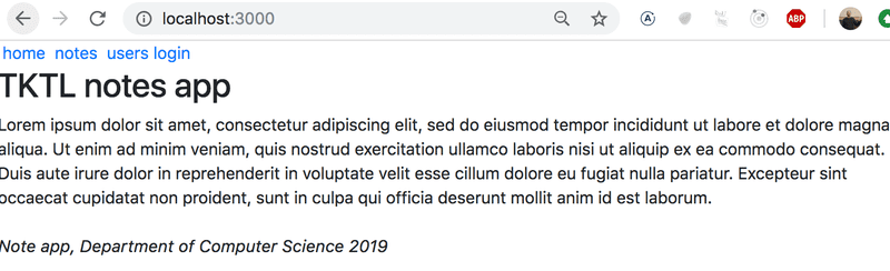
// ...
</head>When we reload the application, we notice that it already looks a bit more stylish:
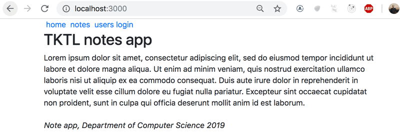
In Bootstrap, all of the contents of the application are typically rendered inside of a container. In practice this is accomplished by giving the root div element of the application the container class attribute:
const App = () => {
  // ...

  return (
    <div className="container">      // ...
    </div>
  )
}
We notice that this already has an effect on the appearance of the application. The content is no longer as close to the edges of the browser as it was earlier:
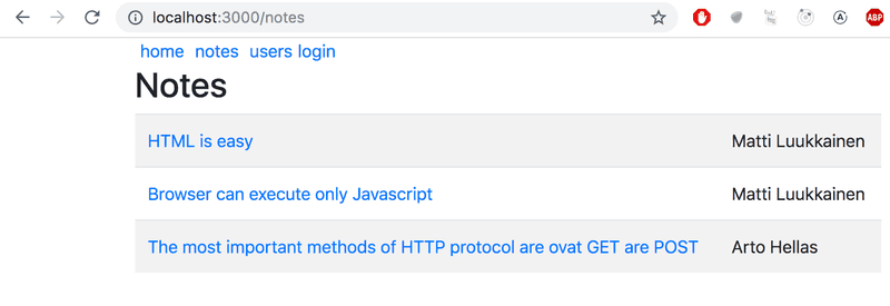
Next, let's make some changes to the Notes component, so that it renders the list of notes as a table. React Bootstrap provides a built-in Table component for this purpose, so there is no need to define CSS classes separately.
const Notes = (props) => (
  <div>
    <h2>Notes</h2>
    <Table striped>
      <tbody>
        {props.notes.map(note =>
          <tr key={note.id}>
            <td>
              <Link to={`/notes/${note.id}`}>
                {note.content}
              </Link>
            </td>
            <td>
              {note.user}
            </td>
          </tr>
        )}
      </tbody>
    </Table>
  </div>
)
The appearance of the application is quite stylish:
Notice that the React Bootstrap components have to be imported separately from the library as shown below:
import { Table } from 'react-bootstrap'Forms
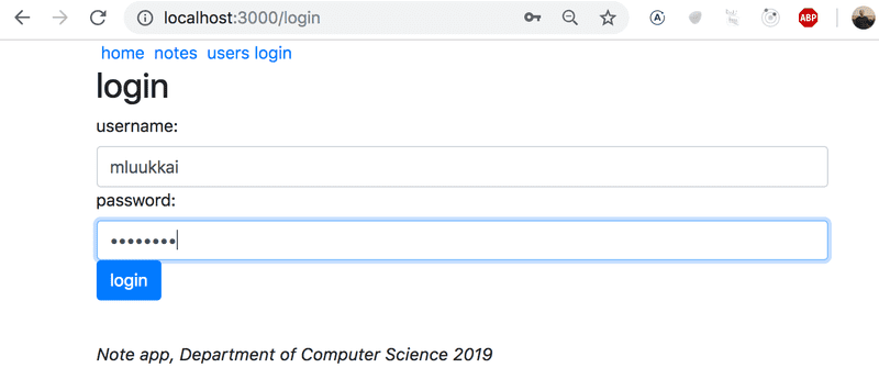
Let's improve the form in the Login view with the help of Bootstrap forms.
React Bootstrap provides built-in components for creating forms (although the documentation for them is slightly lacking):
let Login = (props) => {
  // ...
  return (
    <div>
      <h2>login</h2>
      <Form onSubmit={onSubmit}>
        <Form.Group>
          <Form.Label>username:</Form.Label>
          <Form.Control
            type="text"
            name="username"
          />
          <Form.Label>password:</Form.Label>
          <Form.Control
            type="password"
          />
          <Button variant="primary" type="submit">
            login
          </Button>
        </Form.Group>
      </Form>
    </div>
)}
The number of components we need to import increases:
import { Table, Form, Button } from 'react-bootstrap'After switching over to the Bootstrap form, our improved application looks like this:
Notification
Now that the login form is in better shape, let's take a look at improving our application's notifications:
Let's add a message for the notification when a user logs in to the application. We will store it in the message variable in the App component's state:
const App = () => {
const [notes, setNotes] = useState([
// ...
])
const [user, setUser] = useState(null)
const [message, setMessage] = useState(null)
const login = (user) => {
setUser(user)
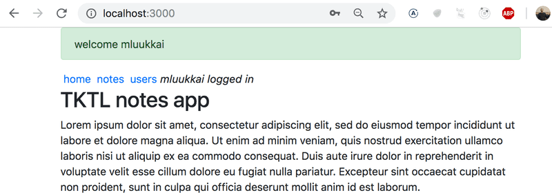
setMessage(`welcome ${user}`) setTimeout(() => { setMessage(null) }, 10000) }
// ...
}We will render the message as a Bootstrap Alert component. Once again, the React Bootstrap library provides us with a matching React component:
<div className="container">
  <Router>
    <div>
      {(message &&        <Alert variant="success">          {message}        </Alert>      )}    //...
)}
Navigation structure
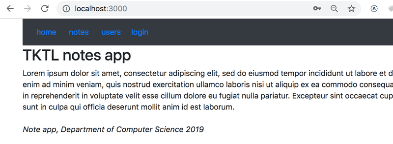
Lastly, let's alter the application's navigation menu to use Bootstrap's Navbar component. The React Bootstrap library provides us with matching built-in components. Through trial and error, we end up with a working solution in spite of the cryptic documentation:
<Navbar collapseOnSelect expand="lg" bg="dark" variant="dark">
  <Navbar.Toggle aria-controls="responsive-navbar-nav" />
  <Navbar.Collapse id="responsive-navbar-nav">
    <Nav className="mr-auto">
      <Nav.Link href="#" as="span">
        <Link style={padding} to="/">home</Link>
      </Nav.Link>
      <Nav.Link href="#" as="span">
        <Link style={padding} to="/notes">notes</Link>
      </Nav.Link>
      <Nav.Link href="#" as="span">
        <Link style={padding} to="/users">users</Link>
      </Nav.Link>
      <Nav.Link href="#" as="span">
        {user
          ? <em>{user} logged in</em>
          : <Link to="/login">login</Link>
        }
      </Nav.Link>
    </Nav>
  </Navbar.Collapse>
</Navbar>
The resulting layout has a very clean and pleasing appearance:
If the viewport of the browser is narrowed, we notice that the menu "collapses" and it can be expanded by clicking the "hamburger" button:
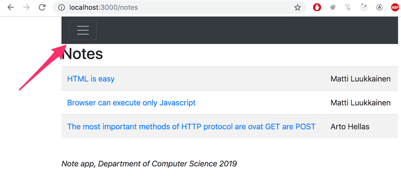
Bootstrap and a large majority of existing UI frameworks produce responsive designs, meaning that the resulting applications render well on a variety of different screen sizes.
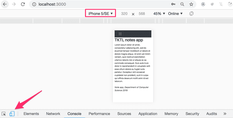
Chrome developer tools makes it possible to simulate using our application in the browser of different mobile clients:
You can find the complete code for the application here.
Semantic UI
I have used Bootstrap for years but approximately a year ago I switched over to using Semantic UI. The exercise submission system that is used in this course has been made with Semantic and my experience has been reassuring. The support for React is world class and the documentation is leagues above Bootstrap.
Let's continue working with the React-router example application we just styled with Bootstrap, but this time style it with Semantic UI.
We will start by installing the semantic-ui-react package:
npm install --save semantic-ui-reactThen let's add the link to the CSS stylesheet for Semantic UI inside the head tag of the application's public/index.html file (the link can be found here):
<head>
  <link
    rel="stylesheet"
    href="//cdn.jsdelivr.net/npm/semantic-ui@2.4.2/dist/semantic.min.css"
  />
  // ...
</head>
We render all of the application's content inside of Semantic's Container component.
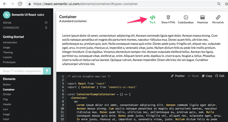
The documentation for Semantic UI contains several code examples for each component. This makes it easy to see how each component is used in practice:
Let's swap out the root div element of App for a Container component:
import { Container } from 'semantic-ui-react'

// ...

const App = () => {
  // ...
  return (
    <Container>
      // ...
    </Container>
  )
}
The content of the application is no longer attached to the edges of the browser.
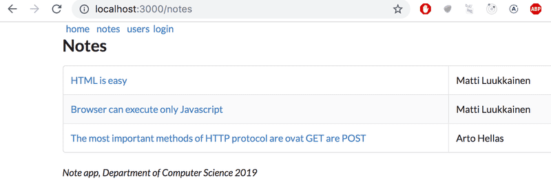
Just like we did with Bootstrap, let's render the notes as a table with Semantic's Table component. The resulting code looks like this:
import { Table } from 'semantic-ui-react'

const Notes = (props) => (
  <div>
    <h2>Notes</h2>
    <Table striped celled>
      <Table.Body>
        {props.notes.map(note =>
          <Table.Row key={note.id}>
            <Table.Cell>
              <Link to={`/notes/${note.id}`}>
                {note.content}
              </Link>
            </Table.Cell>
            <Table.Cell>
              {note.user}
            </Table.Cell>
          </Table.Row>
        )}
      </Table.Body>
    </Table>
  </div>
After making these changes, the list of notes looks like this:
Form
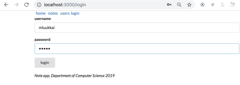
Let's use Semantic's Form component in the login view of the application:
import { Form, Button } from 'semantic-ui-react'

let Login = (props) => {
  const onSubmit = (event) => {
    // ...
  }

  return (
    <Form onSubmit={onSubmit}>
      <Form.Field>
        <label>username</label>
        <input name='username' />
      </Form.Field>
      <Form.Field>
        <label>password</label>
        <input type='password' />
      </Form.Field>
      <Button type='submit'>login</Button>
    </Form>
  )
}
The appearance of the new login view looks like this:
Notification
Just like we did with the Bootstrap version, let's implement a styled notification that is displayed after a user logs in to the application:
As we did previously, let's store the message of the notification in the message variable in the App component's state:
const App = () => {
  // ...
  const [message, setMessage] = useState(null)

  const login = (user) => {
    setUser(user)
    setMessage(`welcome ${user}`)
    setTimeout(() => {
      setMessage(null)
    }, 10000)
  }

  // ...
}
And let's render the notification by using Semantic's Message component:
<Container>
  {(message &&
    <Message success>
      {message}
    </Message>
  )}
  // ...
</Container>
Navigation structure
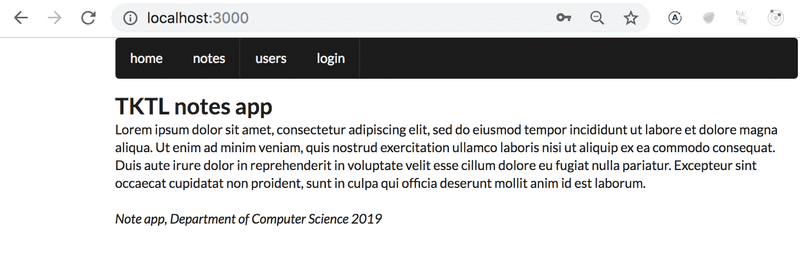
The navigation bar of the application will be implemented with Semantic's Menu component:
<Router>
  <div>
    <Menu inverted>
      <Menu.Item link>
        <Link to="/">home</Link>
      </Menu.Item>
      <Menu.Item link>
        <Link to="/notes">notes</Link>
      </Menu.Item>
      <Menu.Item link>
        <Link to="/users">users</Link>
      </Menu.Item>
      <Menu.Item link>
        {user
          ? <em>{user} logged in</em>
          : <Link to="/login">login</Link>
        }
      </Menu.Item>
    </Menu>
    // ...
  </div>
</Router>
The result looks like this:
You can find the complete code for the application here.
Closing thoughts
The difference between React-Bootstrap and Semantic-UI-React is not that big. Determining which one produces more aesthetically pleasing results comes down to a matter of taste. After years of using Bootstrap, the reasons that made me switch over to Semantic UI were its seamless integration with React, its wider selection of built-in components, and its overall better documentation. There has been some uncertainty regarding the future of Semantic UI, so it's recommended to keep your ear on the ground.
In the two previous examples, we used the UI frameworks with the help of React-integration libraries.
Instead of using the React Bootstrap library, we could have just as well used Bootstrap directly by defining CSS classes to our application's HTML elements. Instead of defining the table with the Table component:
<Table striped>
  // ...
</Table>
We could have used a regular HTML table and added the required CSS class:
<table className="table striped">
  // ...
</table>
The benefit of using the React Bootstrap library is not that evident from this example.
In addition to making the frontend code more compact and readable, another benefit of using React UI framework libraries is that they include the JavaScript that is needed to make specific components work. Some Bootstrap components require a few unpleasant JavaScript dependencies that we would prefer not to include in our React applications.
Some potential downsides to using UI frameworks through integration libraries instead of using them "directly", are that integration libraries may have unstable API's and poor documentation. The situation with Semantic UI React is a lot better than with many other UI frameworks, as it is an official React integration library.
There is also the question of whether or not UI framework libraries should be used in the first place. It is up to everyone to form their own opinion, but for people lacking knowledge in CSS and web design they are very useful tools.
Other UI frameworks
Here are some other UI frameworks for your consideration. If you do not see your favorite UI framework in the list, please make a pull request to the course material.
Styled components
There are also other ways of styling React applications that we have not yet taken a look at.
The styled components library offers an interesting approach for defining styles through tagged template literals that were introduced in ES6.
Let's make a few changes to the styles of our application with the help of styled components. First, let's define two components for defining styles:
import styled from 'styled-components'

const Button = styled.button`
  background: Bisque;
  font-size: 1em;
  margin: 1em;
  padding: 0.25em 1em;
  border: 2px solid Chocolate;
  border-radius: 3px;
`

const Input = styled.input`
  margin: 0.25em;
`
The code above creates styled versions of the button and input HTML elements and then assigns them to the Button and Input variables.
The syntax for defining the styles is quite interesting, as the CSS rules are defined inside of backticks.
The styled components that we defined work exactly like regular button and input elements, and they can be used the same way:
const Login = (props) => {
  // ...
  return (
    <div>
      <h2>login</h2>
      <form onSubmit={onSubmit}>
        <div>
          username:
          <Input />        </div>
        <div>
          password:
          <Input type='password' />        </div>
        <Button type="submit" primary=''>login</Button>      </form>
    </div>
  )
}
Let's create a few more components for styling that application, that are styled versions of div elements:
const Page = styled.div`
  padding: 1em;
  background: papayawhip;
`

const Navigation = styled.div`
  background: BurlyWood;
  padding: 1em;
`

const Footer = styled.div`
  background: Chocolate;
  padding: 1em;
  margin-top: 1em;
`
Let's use the components in our application:
const App = () => {
// ...
return (
<Page> <Router>
<div>
<Navigation> <Link style={padding} to="/">home</Link>
<Link style={padding} to="/notes">notes</Link>
<Link style={padding} to="/users">users</Link>
{user
? <em>{user} logged in</em>
: <Link to="/login">login</Link>
}
</Navigation>
<Route exact path="/" render={() => <Home />} />
<Route exact path="/notes" render={() =>
<Notes notes={notes} />}
/>
<Route exact path="/notes/:id" render={({ match }) =>
<Note note={noteById(match.params.id)} />}
/>
<Route path="/users" render={() =>
user ? <Users /> : <Redirect to="/login" />
} />
<Route path="/login" render={() =>
<Login onLogin={login} />}
/>
</div>
</Router>
<Footer> <em>Note app, Department of Computer Science 2019</em>
</Footer>
</Page>
)
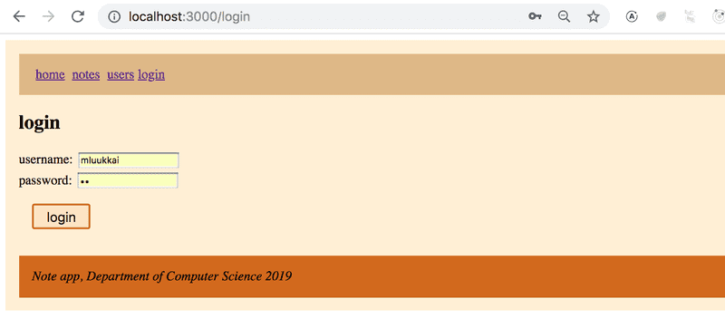
}The appearance of the resulting application is shown below:
Styled components have seen a consistent growth in popularity in recent times, and quite a lot of people consider it to be the best way of defining styles to React applications.

